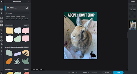
Creating the advertisement:
To create my own advertisement I used ''Pixlr'' I first found an image that I would like to use that would fit my advertisement.
I ended up using a picture of my rabbit, Theodore, as he fits into the theme of my advert which is removing rabbits from the connotation of Easter.
In Pixlr, I uploaded the image by pressing add element/image, to upload a picture from my files. After this I followed the same steps to upload my logo, and I had moved it to the bottom right corner.
 |
| This is what the image looked like after. |
After this I proceeded to add a new layer and selected ''add text'' I then chose what I wanted to write in the font and it was my tagline, ''Adopt don't shop,'' this is to imply that people should resort to adoption and not buying animals from shops.
Too add the pink shape I went into ''add element/image'' and then went into shapes
and chose this shapes as it fits in well to the background. I added a new layer and added some text that said: ''Not just for Easter, They're Life.'' I did this in the font ''Bebasuene'', in white as I thought it would be a nice contrast. I think the slogan would stand out well and also pass on the message that I am trying to convey.
This is what my final design looked like, after I had put everything in place.
 |
| My final advertisement. |


Good that you posted this and explained the process. However, think carefully about your pink bubble and white text inside it. It is difficult to read light text in a light background. You need a separate post with your final advertisement poster with your reflection paragraph.
ReplyDelete